For many years pie charts have been a key player in the chosen charts used in for PowerPoint presentations. One downside to a pie chart is the inability to display the bigger picture. With a donut chart you are able to effectively show higher lever stats, like overall sales of a department. Tableau enables you to take full advantage of this, and I’m going to show you exactly how!
Unlike other visual types, donut chart is not actually something Tableau automatically has available. Though it is similar to a pie chart, in that they divide a circle into different sectors based on their value or proportion of the total. But the main difference between the charts is that a donut chart is able to showcase more than one data series as additional rings. The following is walk through on creating your own donut chart.
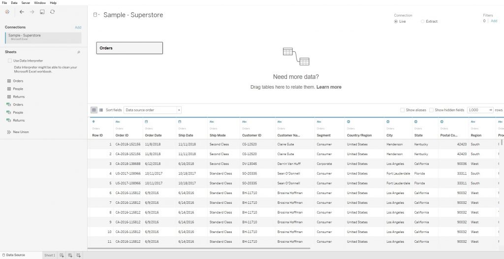
Step 1 – Connect to your dataset
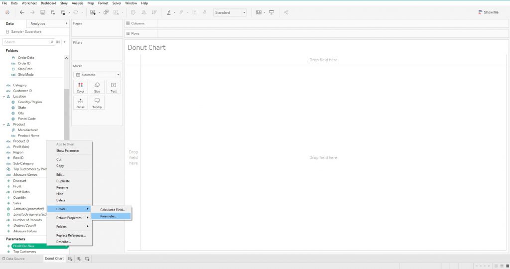
Step 2 – Creating a Parameter
In order to create a donut chart in Tableau, you need to create a pie chart first. The pie chart is the foundation of our donut chart and is used to get the basic shape. The pie chart requires the use of two components, the goal and the actual value.
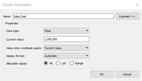
After that you need to fill out the fields for the new parameter. It is important to select the correct data type and setting the correct “Allowable values”, because this will affect the outcome. When finished, click ok.
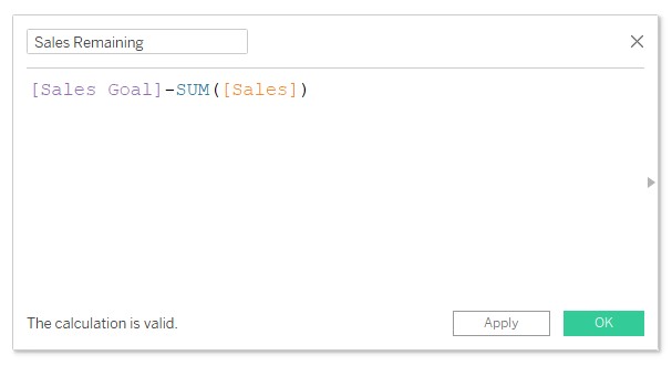
Step 3 – Creating a Calculated Field
Next we need to create a calculated field. I am going to name it “Sales Remaining” which will represent the Sales Goal minus the Sum of Sales. This can be translated to any other example you may have as simply Goal minus Sales equals Remaining.
Step 4 – Creating the Pie Chart
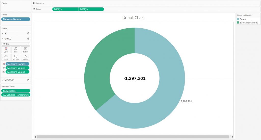
For the purpose of this example, I chose to create a donut chart for Sales. My two components are the new parameter I created, “Sales Goal” and the “Sum of Sales”. Next I placed “SUM(Sales)” and “Sales Remaining” into the rows section and “Measure Names” into columns.
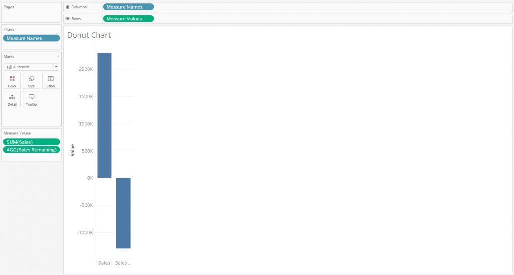
After that, click on the “Automatic” drop down menu under the “Marks” shelf on the left side of the screen and select “Pie”. This should change your visual into two separate blue circles, separated by Sales and Sales Remaining.
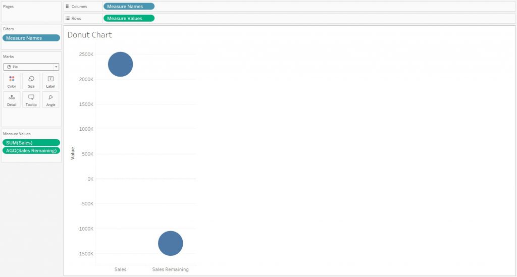
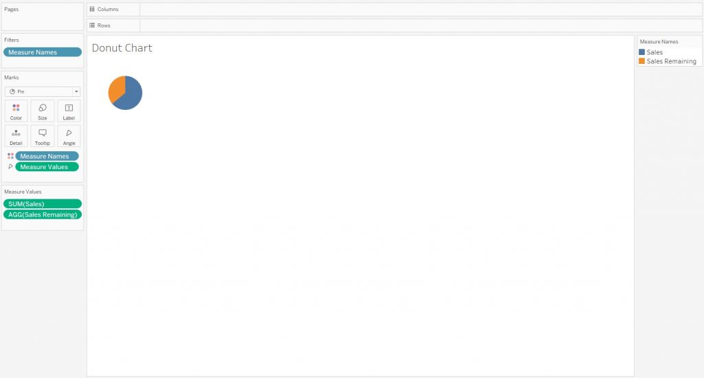
Next drag “Measure Name” to “Color” and “Measure Values” to “Angle” under the Marks shelf. This should result in a pie chart being created.
Step 5 – Creating the Dual Axis & The Donut
Now we need to split the pie chart. A quick way to do this is by creating a calculated field that won’t affect the calculation. An example of this is a pseudo formula “1” which is nothing but a value. After that change the measure to “Minimum”.
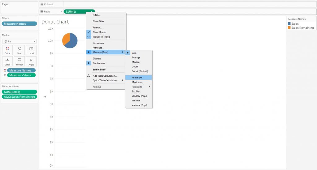
Next hold down the Ctrl key and click and drag MIN(1) in the rows to duplicate it. You should now see 2 duplicate pie charts. Under the marks shelf select MIN(1)(2) and right click and remove the “Measure Names” and “Measure Values”.
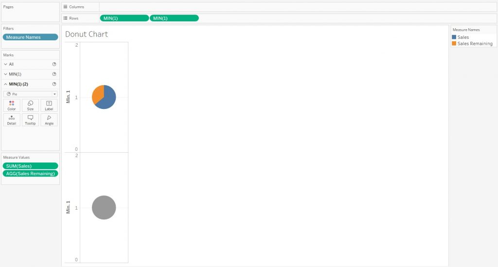
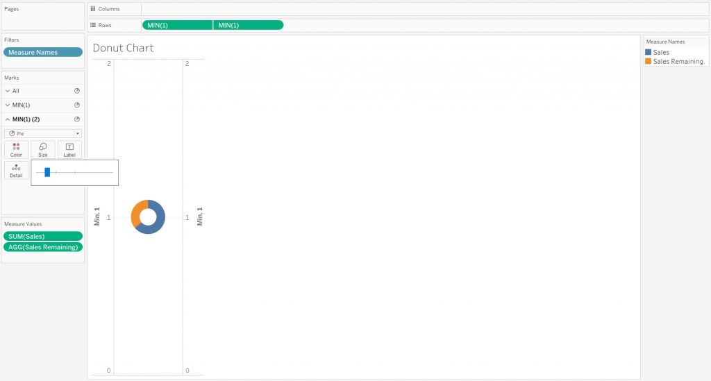
Now navigate back to MIN(1) and MIN(1) in the Rows. Right click the second MIN(1) and select “Dual Axis”. Your two charts will now overlap one another. To fix this go to MIN(1)(2) and reduce the size of the circle. You can also change the color of the circle.
Step 5 – Formatting your Donut Chart
The last step is formatting your donut chart to fit the aesthetic that you are wanting. You are able to remove the second header to the right of the chart by right clicking and un-enabling “Show Header”. Another helpful thing you can do is drag and drop AGG(Sales Remaining) onto the Label mark to make it more legible. Next you can drag the edge of the chart to increase or decrease the size of the visual. The color of your donut chart can also be adjusted by right clicking “Measure Name” and selecting “Edit Colors” from either the legend or marks card.