An engaging visual is an excellent way to too keep your audience interested. A lollipop chart is a great alternative to a typical bar plot because it avoids the typical “cluttered” feeling and excessive amount of “ink” on screen. Not only is it a striking visual, it also excels at differentiating side by side bars. In many cases a lollipop chart can even function as a built-in/simplified legend for your data.
Lollipop charts utilize the length of bars and even color to measure the magnitude. This enables us to easily compare categorical data, like we would typically do in a bar chart. Though it is important to keep in mind that a lollipop chart is not always the best option. In situations where your data is very close, it becomes difficult to make precise comparisons. But most of the time, lollipop charts will be a great upgrade to a boring bar chart. Now let me show you how to make one!
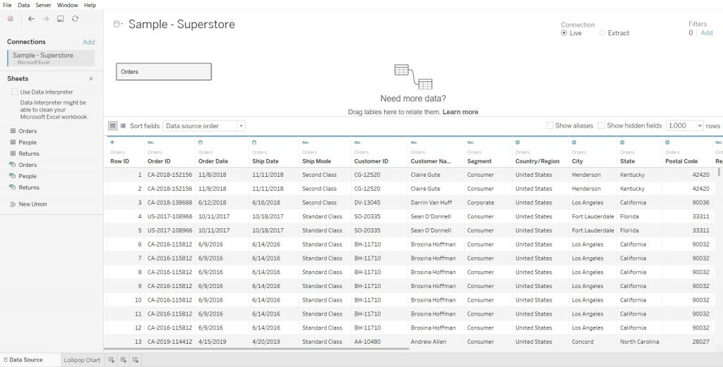
Step 1: Connecting your Data
So the first step is connecting your data set to tableau. Whether you choose to have the connection be “Live” or an “Extract” is entirely up to you. Also make sure that you select all the necessary sheets that you intend to use, from the left panel.
Step 2: Select your desired measures
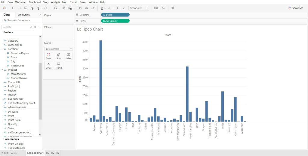
Now that you have your data connected to Tableau, you can now begin setting your desired fields. It is important to understand exactly what your wanting to portray with your with the data, because that is what is going to help you decide which measures you need to use. Once you determine your values, go ahead and drag and drop them into either columns or rows to create a basic bar chart. We will be using this bar chart to create our lollipop chart.
Step 3: Create a Dual Axis by duplicating your measure
In order to create the lollipop chart we have to create a dual axis. First, you need to duplicate one of your measures. An easy way to do this is to hold “Ctrl” on your keyboard and then drag and drop the measure to the right.
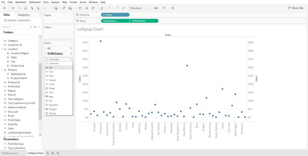
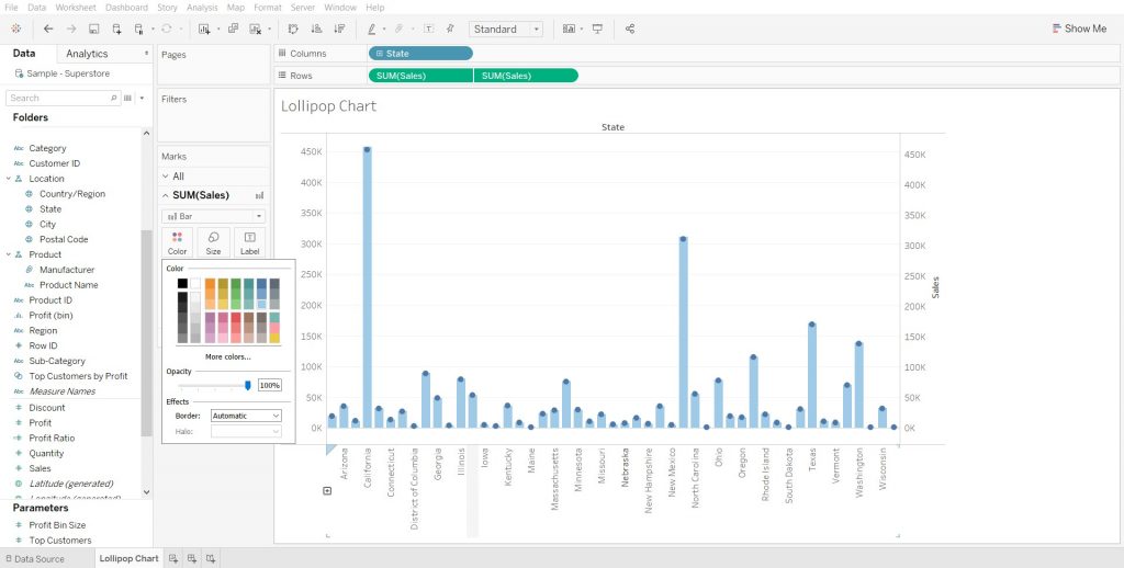
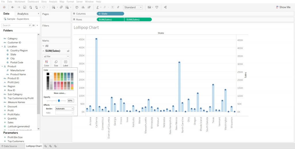
In my example, I chose to duplicate my “Sales” measure. Once you do this, you can create the dual axis by right clicking the second measure (the duplicate we created) and selecting “Dual Axis”. After doing this, your two visuals will merge and will likely convert both visuals into circle charts. To correct this, we can right click the first measure from the “Marks” section and select “Bar”. (section to the left of our visual) After that we can change the color of the bars to make it easier to see the lollipop structure. To do this, select the first measure from the “Marks” section and click color. From there you will be able to select any color and opacity for the lines.
Step 4: Formatting and Improving the Visual
We can now say that we have a a lollipop chart! But there is a few tweaks that we can do to improve the overall aesthetic of the visual. Simple things like making the bars thinner and the circles larger to better mimic a real lollipop, can all be done with a few clicks. The bars can be narrowed following the same process we previously used to change color. The only difference is you will select “Size” instead of “Color”. After that, you can format the circles of the lollipop to be dependent on your measure. (color gradient) In my case I made each circle color-coded based upon the “Total Sales” measure, to improve readability and make comparing each lollipop to another much easier.
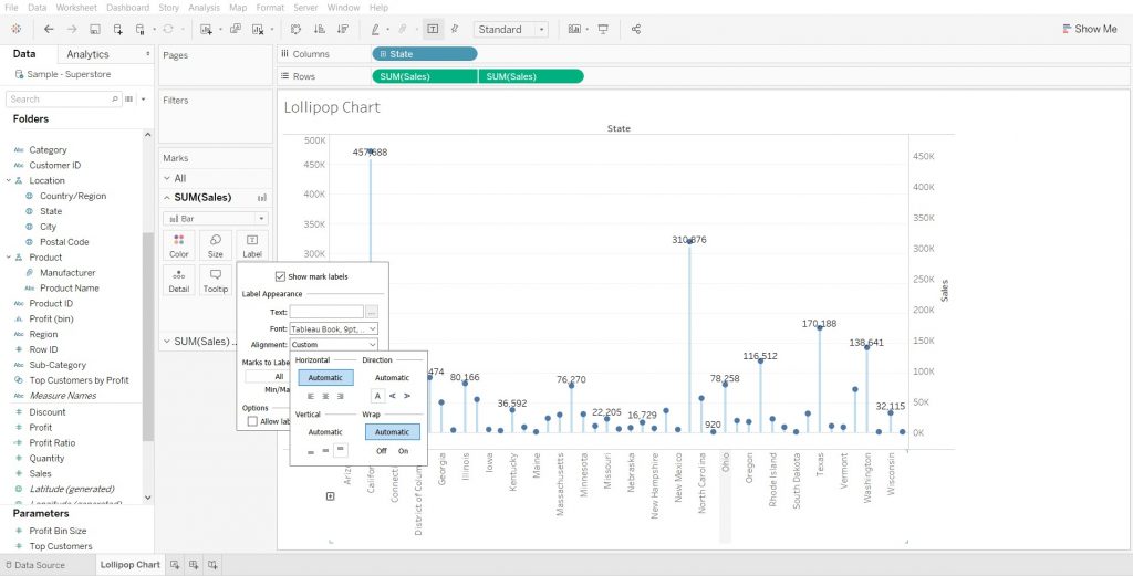
Last, you can remove the second axis (the y-axis to the right of the visual), because it isn’t necessary and clutters your visual. In order to do this, right click the axis and then deselect “Show header”. All done, you have created your first lollipop chart!
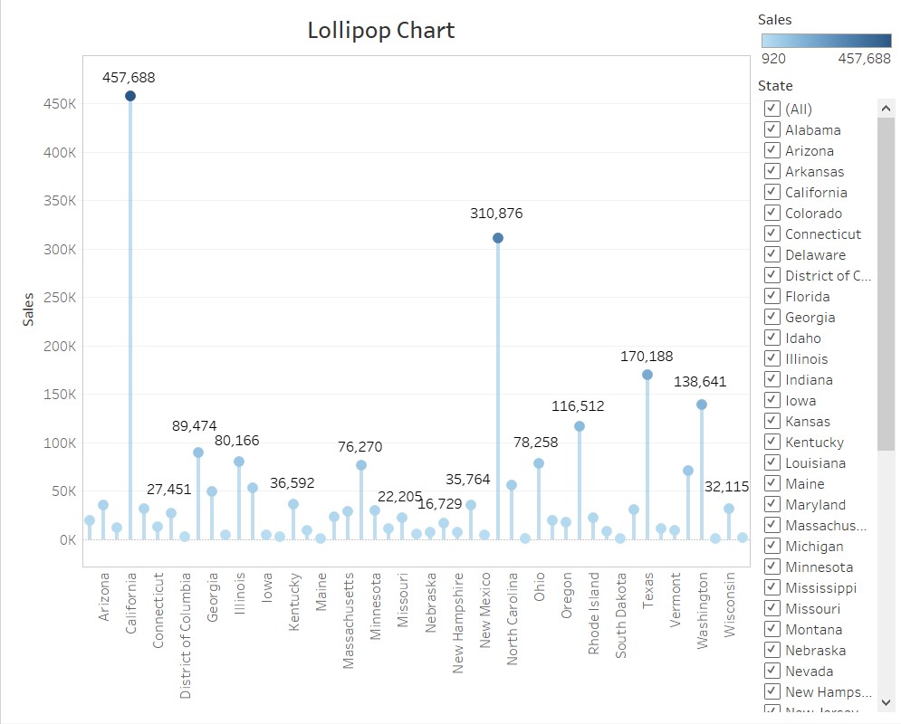
I also decided to add a filter for the states that allow viewers to select/deselect the states that are visible in the chart. I formatted the title and removed some of the borders to create a cleaner, less cluttered visual.